Overview
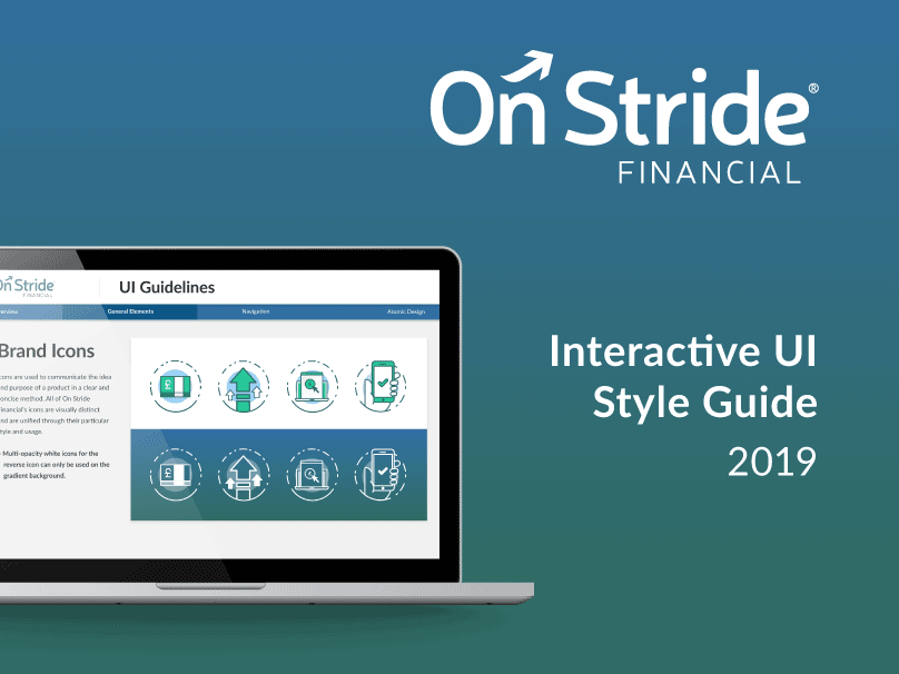
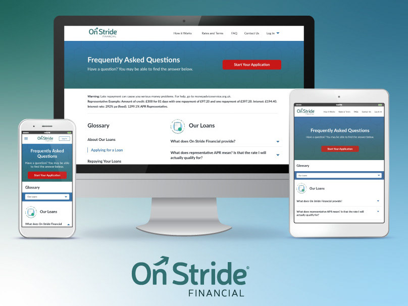
On Stride Financial is a B2C lending company servicing near-prime lenders located in the U.K.
Challenge
Use the updated On Stride Financial branding and create a cohesive account experience for users. The new backend should be accessible, faster, and implement research to provide a better user experience for consumers.
Account Home Redesign
The first step in redesigning the back-end was to update the new account home which would feature information related to the users upcoming payment, auto-pay data, past transactions and future transactions. We also needed to create instances for users who had submitted an application previously but hadn't signed their loan agreement as well as non-eligible users who were using our sister company Pounds to Pocket.
With the redesigns for the account, we internally tested new an updated navigation which allowed users to easily access their loan details and edit their information and preferences.
Default Payment Method
During a different sprint, myself and the copywriter created over 30 screens for all customers types to update their payment information. Previously, the On Stride users would have to phone in to the call center to be able to change their payment method, whether it was to update their debit card or change their direct deposit information. This would create a long wait for the call center and increased the amount of people defaulting on their loans.
In the new designs, users can more easily see what information is on file for their payment preferences and can easily update their payment methods by toggling back and forth between payment methods. This update decreased call center volume and improved on-time payments.
Loan Selection
The redesign of On Stride Financial included a lot of usability testing and A/B testing. One model where this was used the most was in the Loan Selection process. After the user inputs their application page, they are delivered to a page where they can select the amount they would like to withdraw. The first part updating this step was to complete user testing around how a user would want to take out a loan. Through testing, we discovered that users: A) were interested in adjusting their loan amounts, and B) wanted the flexibility to change their monthly payment. Overall, the term length didn't matter as much to our customers as the monthly payment amount did.
Based on this feedback, we decided to A/B test two models. The first model allowed users to have full adjustment of their loan by a slider in the loan amount and monthly payment amount (not applicable for customers who only qualify for the 6 month loan). The second model generated a suggested term list based on the amount the consumer wanted to take out. This model allowed the consumer less precision when trying to determine their loan terms and allowed for quicker selection.
We saw success in both models but ultimately rolled out the section option for the On Stride brand. With the success of both models, we determined this could be tested further in other brands as it might differ based on the customer base.
Role: UI/UX Designer
Timeframe: 5 months
Process: User and market research, usability testing, wireframes,
prototyping, and Agile software development
prototyping, and Agile software development
Team: Self-Driven design, UX copywriter (Ashlyn Keefe), Software Engineering, Product Manager
Wireframes and Full Fidelity: Self-driven
Tools: Adobe XD, Usability Hub, JIRA

