Overview
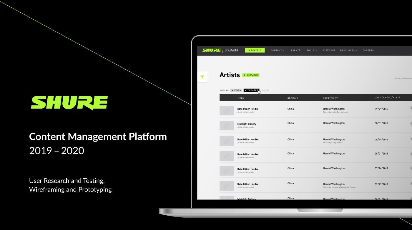
Shcampi is a content management system originally created by the back-end coder at Shure. This system allows marketers to write and post their own content for blogs, case studies, reviews, artists' biographies, and more.
After rolling out the first version of Shcampi, the Global Web Team received a lot of feedback regarding the difficulty of using the new system from users. Shcampi was created to allow marketers to take charge and post their content to reduce the web team's workload, however, this did not occur.
Challenge
It was determined a new 2.0 version of Shcampi needed to be released to be more intuitive and user-friendly. The new version would need to handle form validation, global translations, publishing statuses, publication previews, and more while offering a sleek UI more in line with Shure's branding.
User Interviews
To kickoff the user experience research, the first step was to conduct user interviews with two users in each content category (i.e. blog, case study, reviews, artists bios, and events). This consisted of in-person and Skype interviews with members of the Shure team in multiple countries.
The general consensus is the system was hard to use, there were very few warnings or alerts for error handling, and the navigation and information architecture was cumbersome. This became a primary area of focus for the redesign.
Wireframing
& Prototyping
& Prototyping
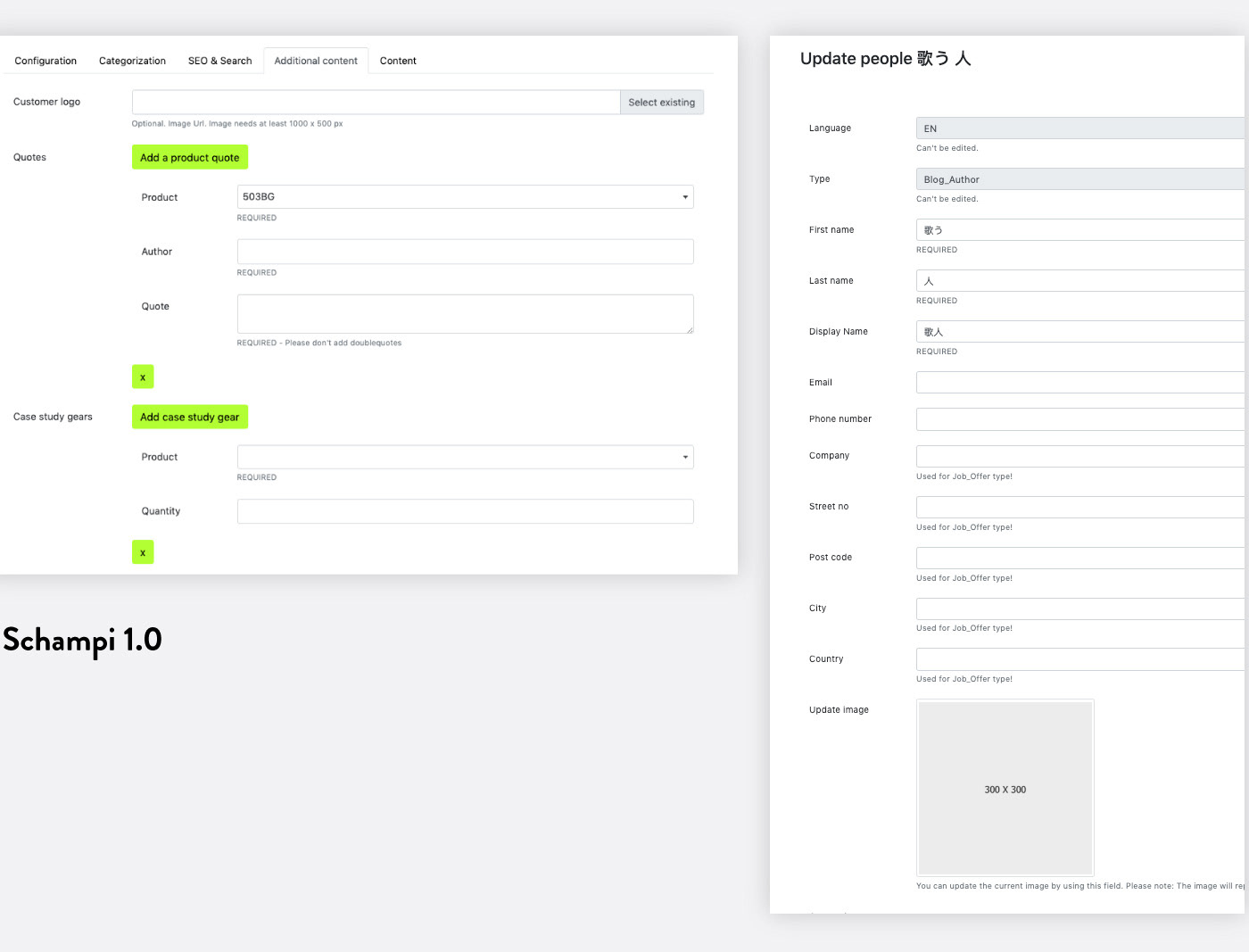
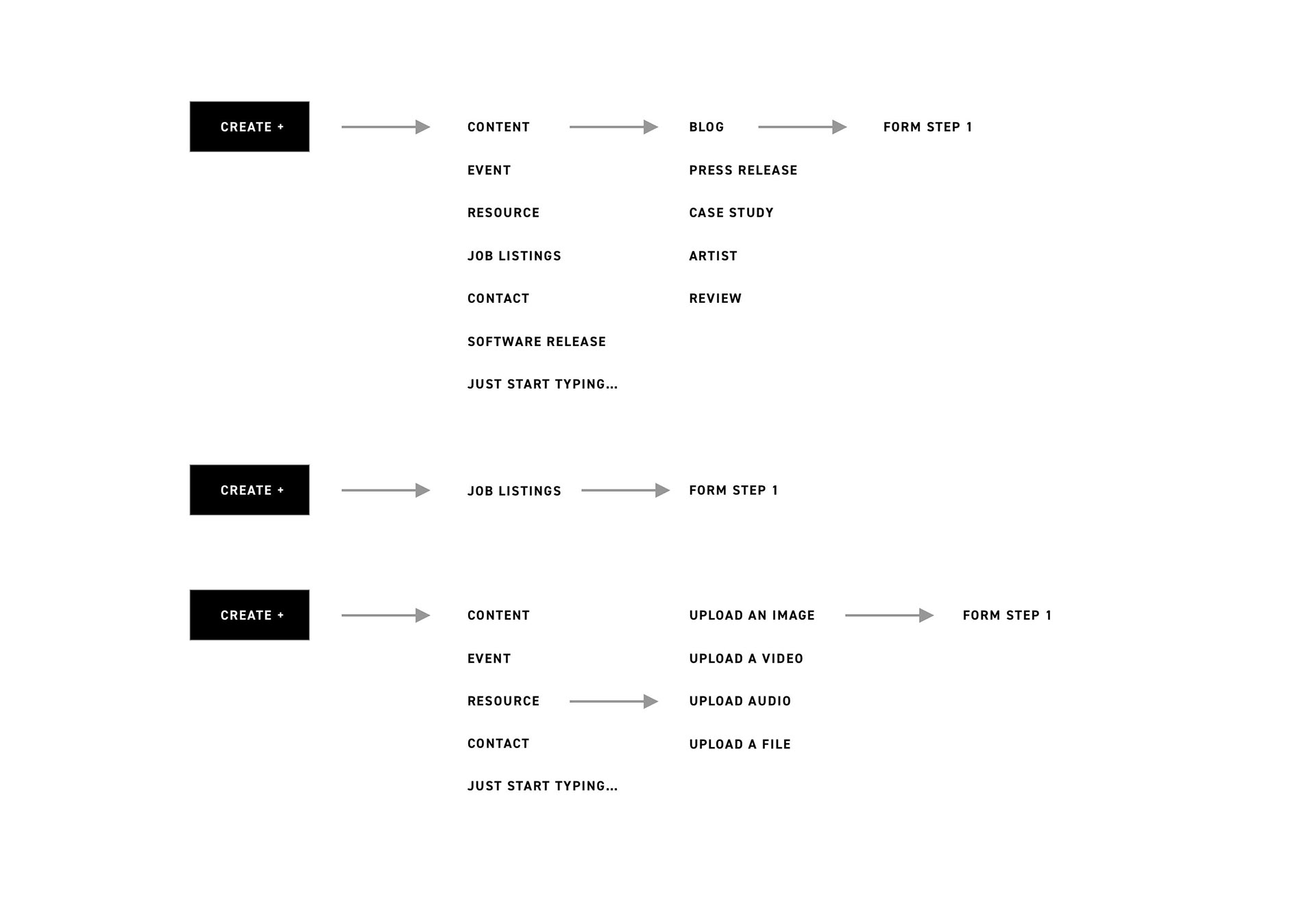
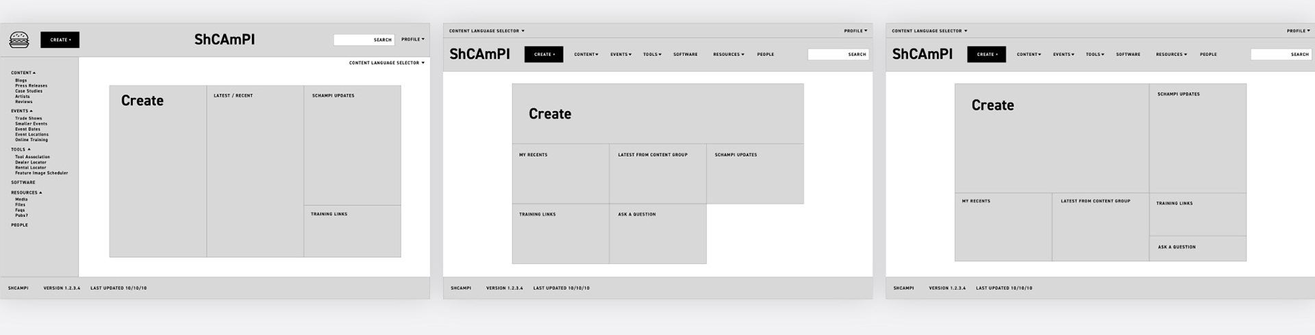
The first step to creating the wireframes was to review the navigation structure and user flow. In Shcampi 1.0, the only way a user was able to create new content was by navigating to the specific content type page (i.e. blog posts), and clicking the create button within the listing page. With the new design, it was important to allow user to create as soon as they open Shcampi, as well as any time throughout the site by incorporating it into the navigation.
Homepage
After mapping out the creation flow, myself and the other designer worked on wireframing the home page and general form experience. Based on user feedback, we turned the homepage into a creation hub for the user, allowing them to create new content, see new posts in their categories, and added a review-approval process for administrative users.
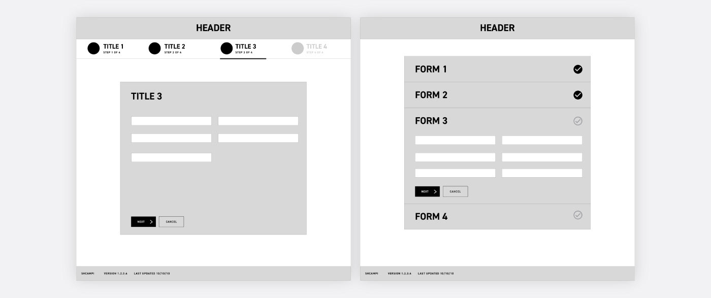
Forms
I worked on updating the forms to navigate the user through creation. This included changing the tabbed design which allowed users to move forward without validation only to receive an error to a new interactive workflow including feedback, additional helper text and tooltips, and warnings for mandatory fields that have been skipped. The new design does not allow the user to be able to move on to the next section until the current step is complete.
Final Design
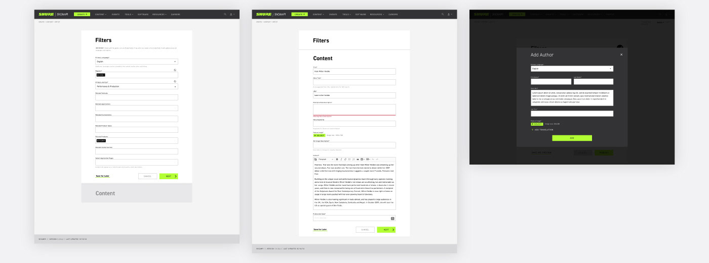
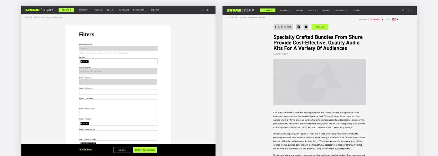
After wireframe approval from stakeholders, I gained full ownership of the design process and worked with a front-end and back-end coders for the project. The goal was to get Shcampi up and running for the marketers within six months so they could start posting their own content. The final design focused on cleaning up the user interface for listing pages, forms, and the translation assistant.
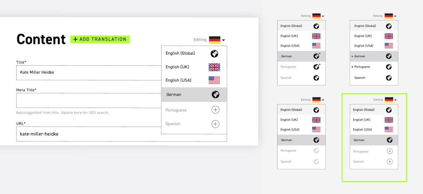
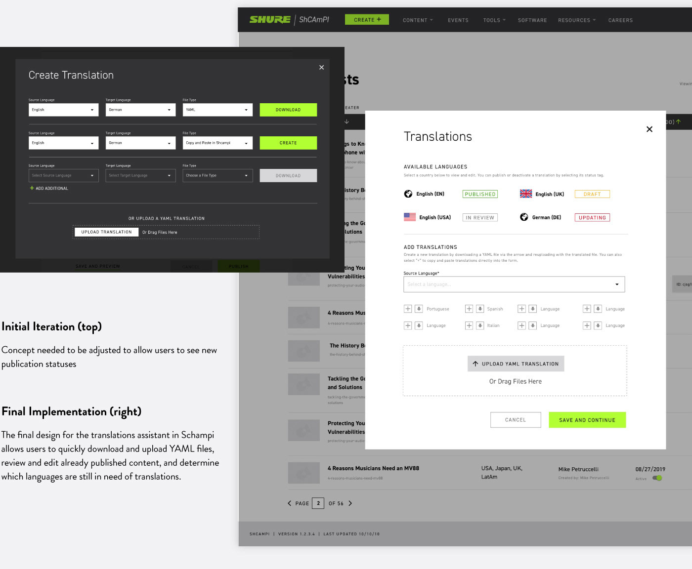
Translations
Shure is a global company with offices located around the world, making translations a mandatory feature within the content management platform. Multiple iterations of the translations feature were created based on feedback key users as well as GraphCMS capabilities and restrictions.
Role: UI/UX Designer
Process: User and market research, user flows, wireframes,
prototyping, visual design
prototyping, visual design
Tools: Sketch, Invision
Timeframe: 6 months
Team: Self-driven design, front-end and back-end developer
Wireframes: Self-driven
Full Fidelity: Self-driven